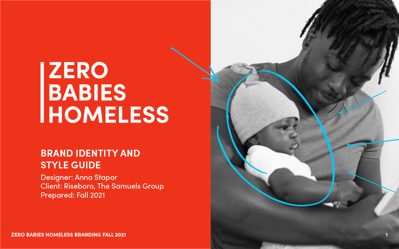
Zero Babies Homeless
Zero Babies Homeless is an initiative led by Riseboro Community Partnership, a non-profit based in Brooklyn offering multiple services to support the New York City community. Established in 1973, they’ve offered services designed to support every generation and meet the needs of communities.
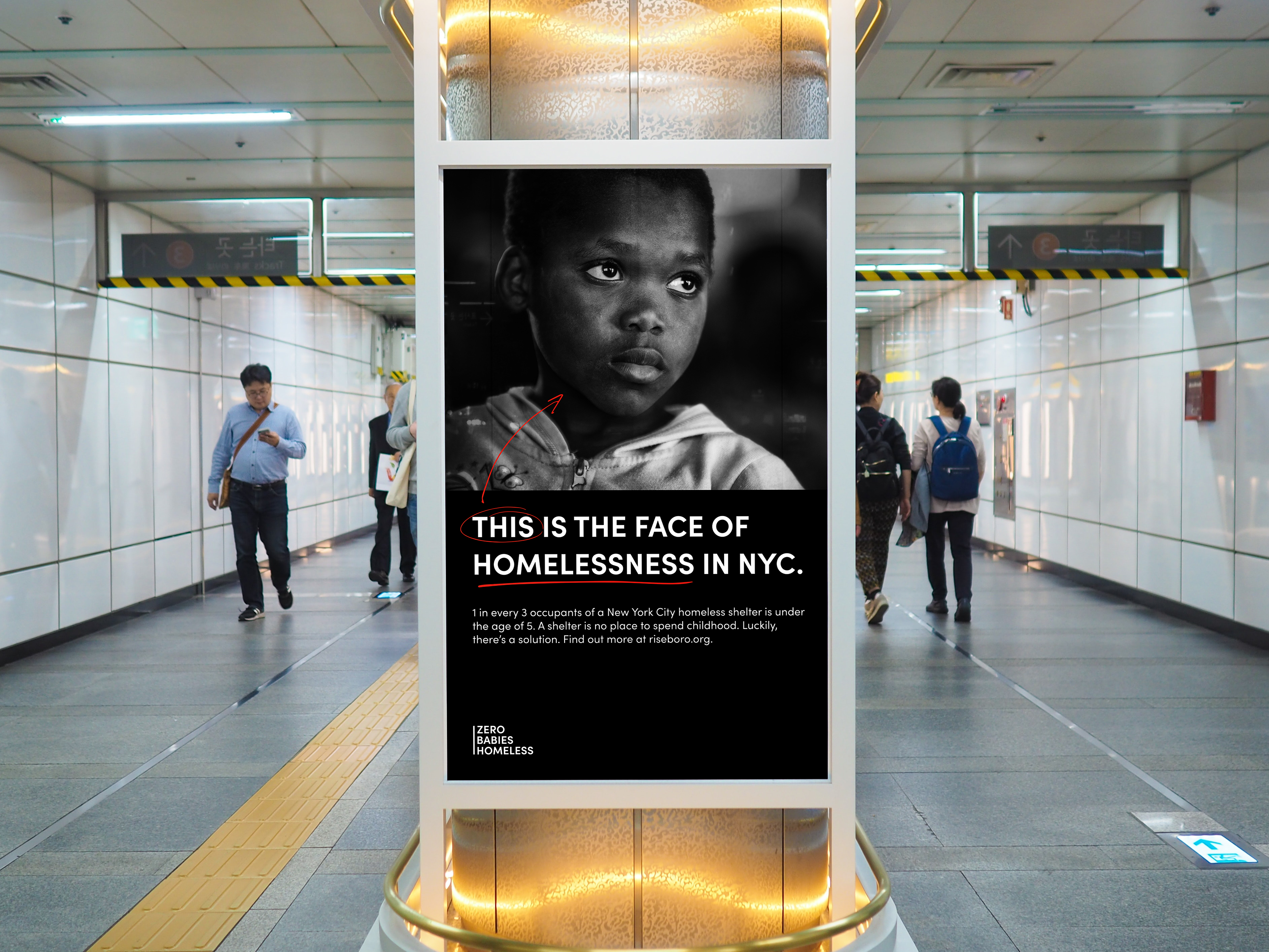
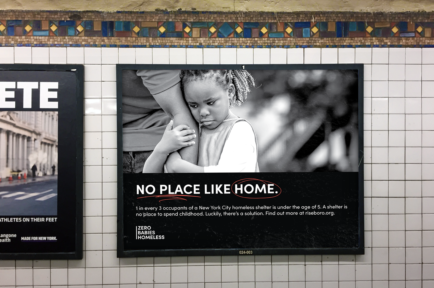
One of their latest initiatives, Zero Babies Homeless, centers on preventing infant homelessness via direct funding to expectant mothers. Riseboro expressed the desire to have an identity for this inititave that was thought-provoking and inspired New Yorkers to take action. Many statistics on this issue aren’t well-known by most, such as the fact that the majority of shelter occupants in NYC is under the age of 5.
Project Brief
Craft a brand image for the Zero Babies Homeless campaign to be used by Riseboro in various promotions such as PSAs, bids to potential donors, and other print assets. Brand must:
1. effectively convey the urgency and severity of the issue the campaign is aimed at solving
2. Catch viewers’ eye and attention quickly
3. Be easily accesible for Riseboro marketing team to follow
1. effectively convey the urgency and severity of the issue the campaign is aimed at solving
2. Catch viewers’ eye and attention quickly
3. Be easily accesible for Riseboro marketing team to follow
Below is a project Mood Board crafted after running the following brand discovery exercises with the Riseboro team:
- What are we known for?: Name statements about what our brand should be known for
-Describe our brand as a person: List traits that would describe our brand if they were an individual
-This not that: describe our brand by listing both what it is and the opposite
-We believe statements: list statements describing what our brand believes
-Key emotions: describe what emotions our brand should invoke

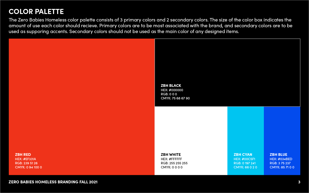
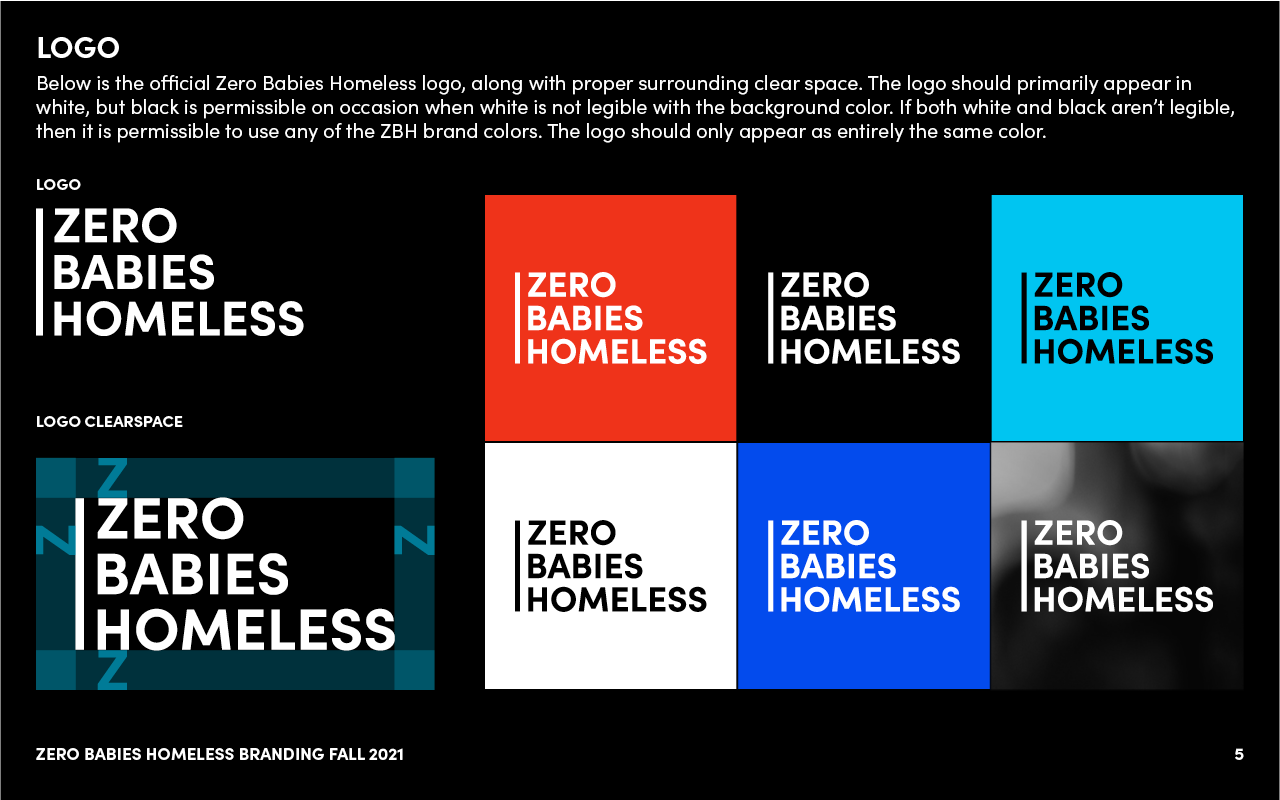
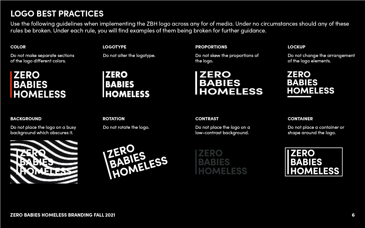
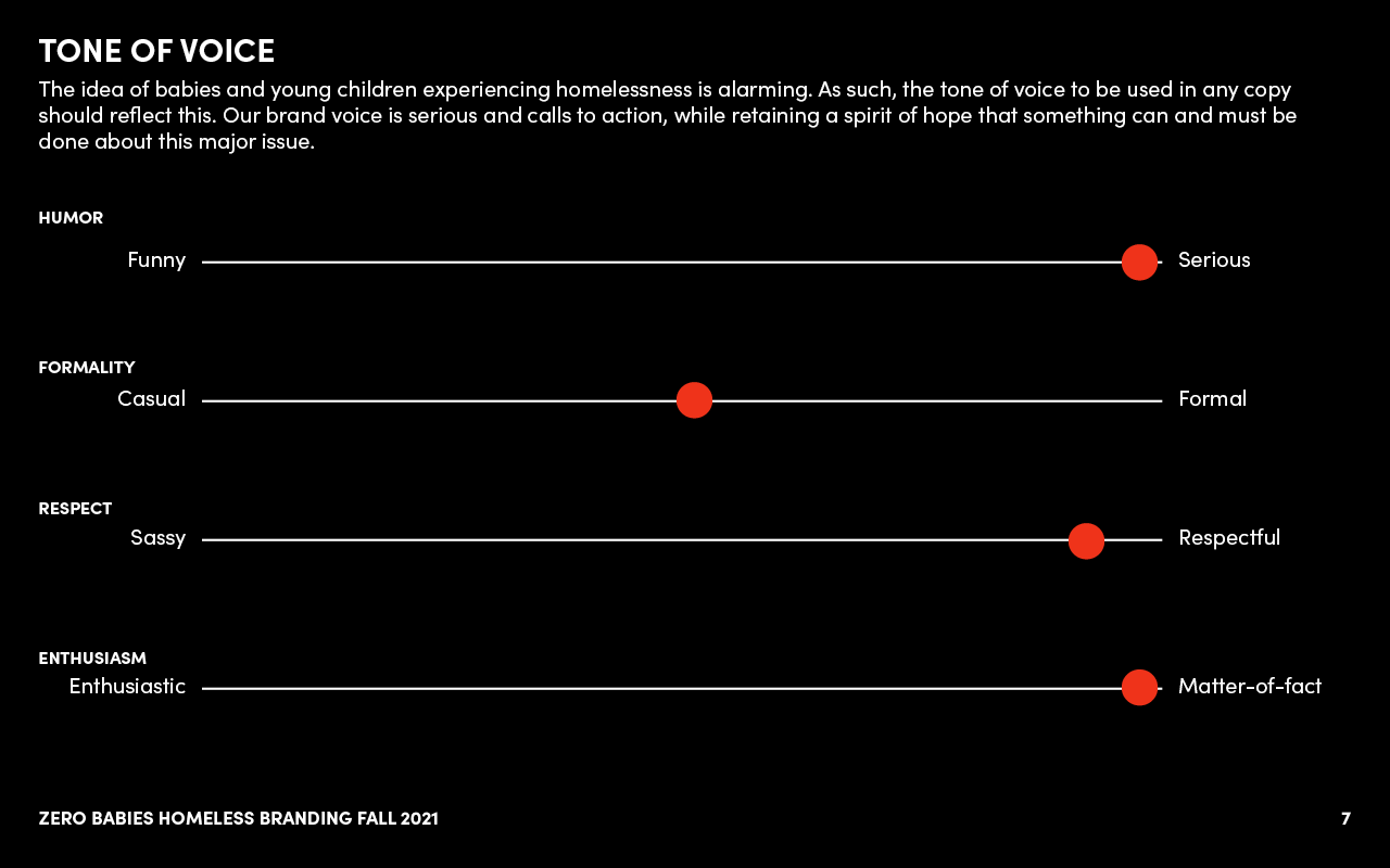
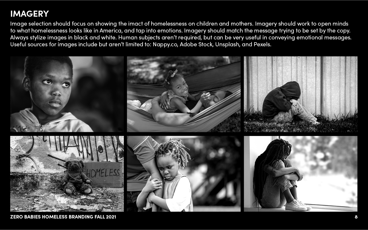
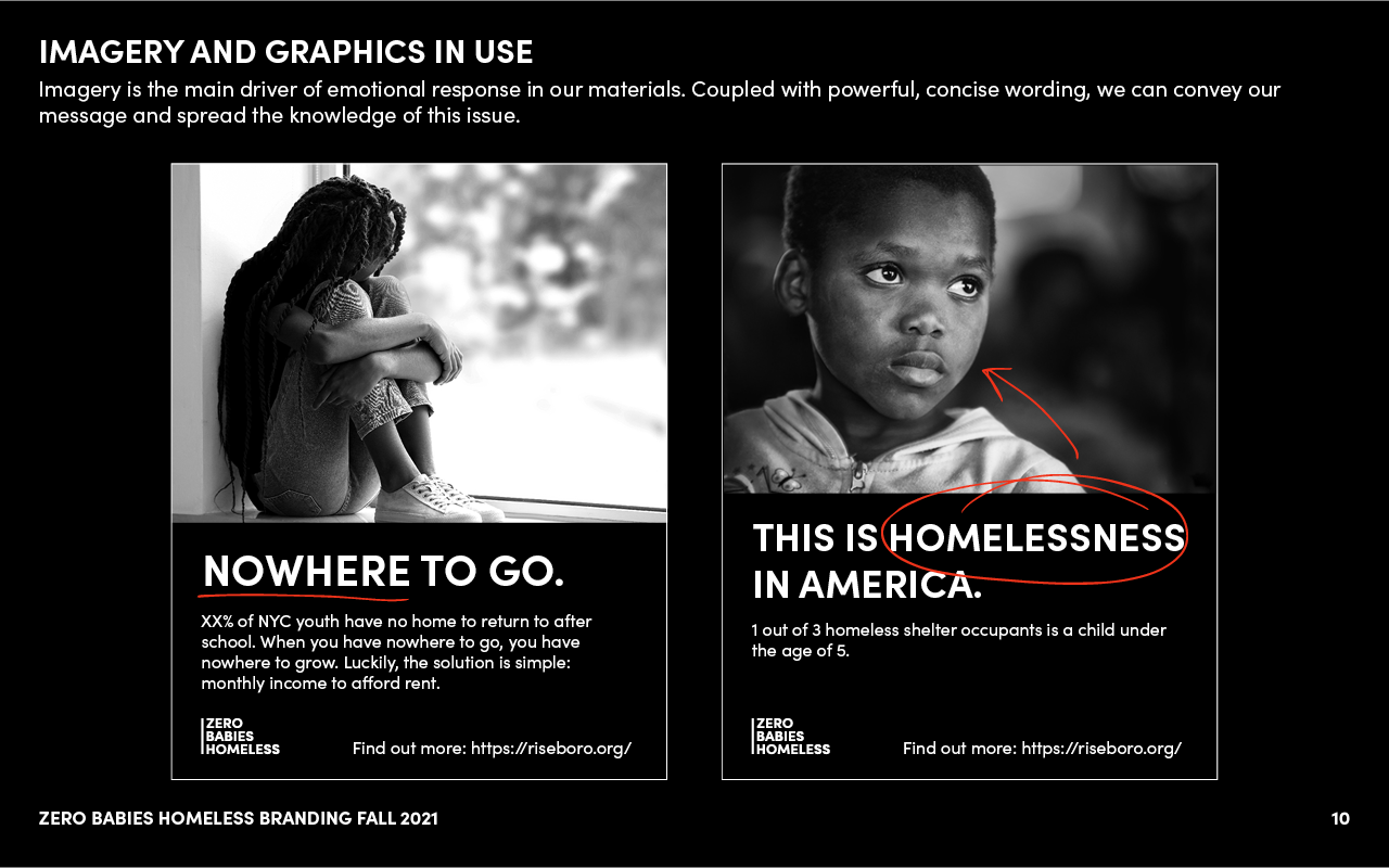
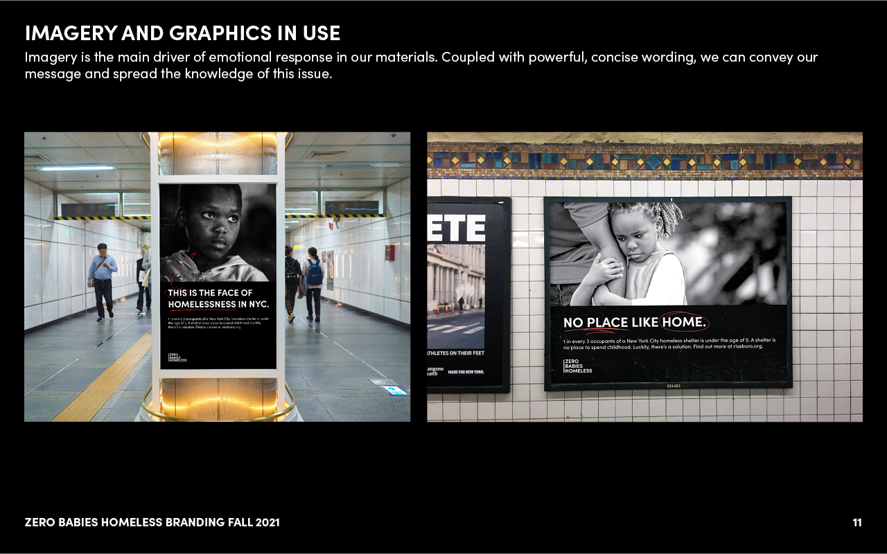
To capture the severity and seriousness of this endeavor, I focused on crafting an identity that is intense, blunt, and emotion-provking. Inspiration was drawn from street art, PSA posters of the 20th century, and the New York City subway: an intersection of people from all walks of life. Sofia Pro was chosen at the typeface to capture a sense of intensity while still remaning approachable. It is direct, attention-grabbing, and quickly legible. The brand colors wer chosen to be stark, bold, and catch the eye quickly with high contrast. The goal was to grab someone’s attention just quickly enough to inform them of this issue and encourage further investigation.

Full project brand guide shown below


Currently, the project is being promoted to various key stakeholders in the city, including the Mayor of New York. Riseboro hopes to get this project off the ground in the coming years.