Arena Strive

Arena Labs wants to change the world of healthcare by caring for it’s most important asset: front-line clinicians.
The goal of this project was to develop a data-based content coaching platform for front-line clinicians, titled “Arena Strive” that provides users with tailored learning content and data-based physiological insights via integration with a WHOOP band. I was approached to help them take their early iteration of the Arena Strive mobile app to the next level with a cleaner design and more modern, engaging experience. I worked alongside a back-end developer, two front-end developers, and a product manager to bring this app to life.
Initial Research
To begin, I took a look at Arena’s first version of their app. I focused on noticing what was currently working and not working in their previous design, as well as getting a deeper understanding of their intended users. It became apparent that the first version of the app had disjointed sections, unclear goals for the user, and made it diffcult to find key information. In addition, the interface was dated
and needed to be more visually engaging.
and needed to be more visually engaging.

Project Goals
After sharing my takeaways with the Arena team and discussing their ideal future app, we determined the following project goals:
After sharing my takeaways with the Arena team and discussing their ideal future app, we determined the following project goals:
· Create an easy-to-navigate content library full of short video lessons for clinicians to learn high-performance medicine
· Provide data-informed insights and content suggestions for a guided learning journey
· Enable clinicians to track their learning progress and feel a sense of accomplishment
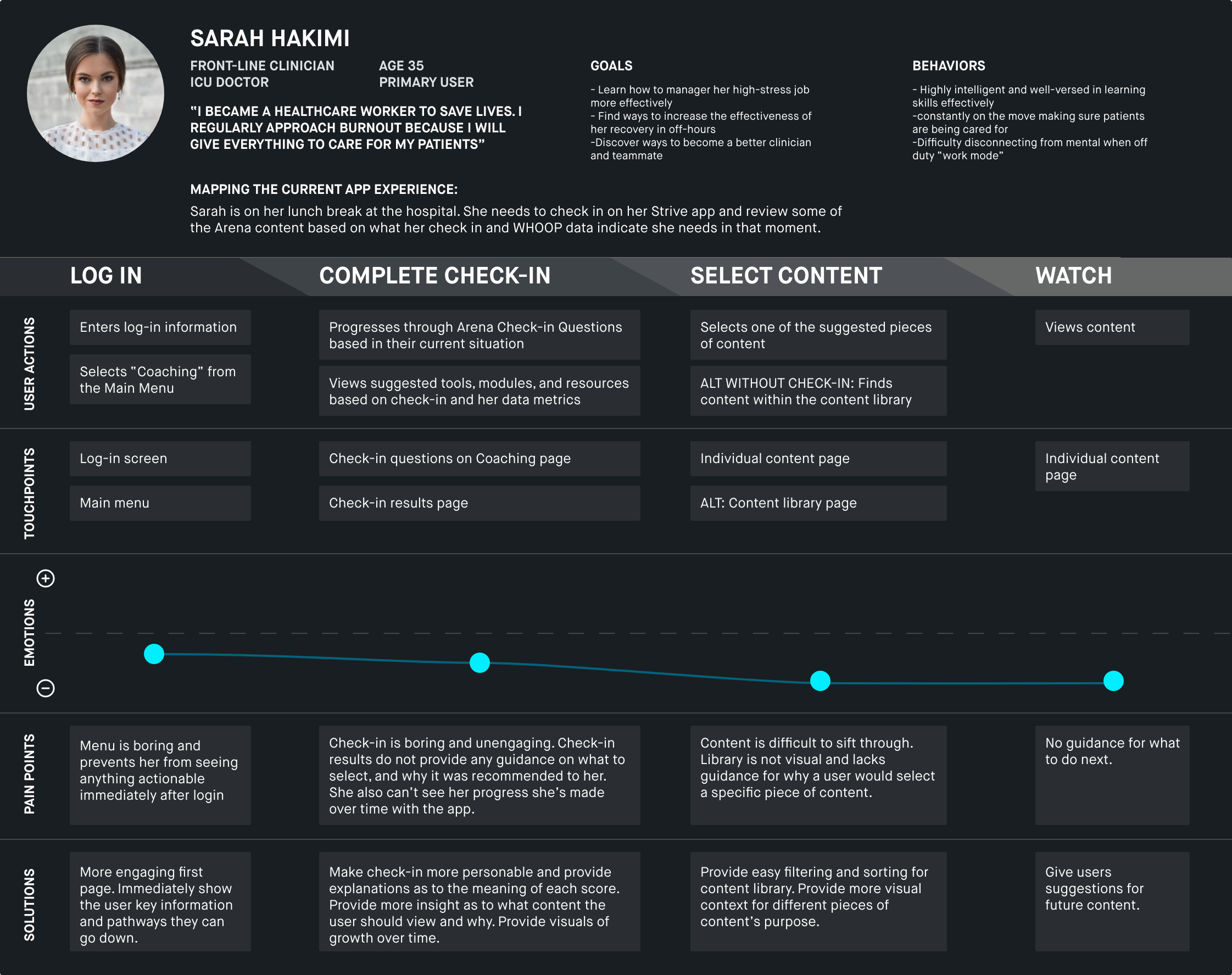
User Journey Map
![]()
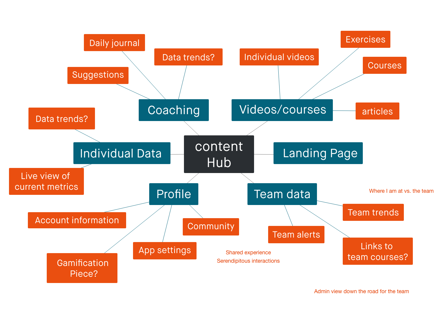
Potential Features Mind Mapping
![]()
Low Fidelity Mockups
Taking insights learned from my research exercises, I then created a set of user flows to guide the key actions that users needed to be able to complete. From there, I crafted a site map, and then finally transitioned into creating low fidelity mockups of the Arena Strive app.
Key User Flows
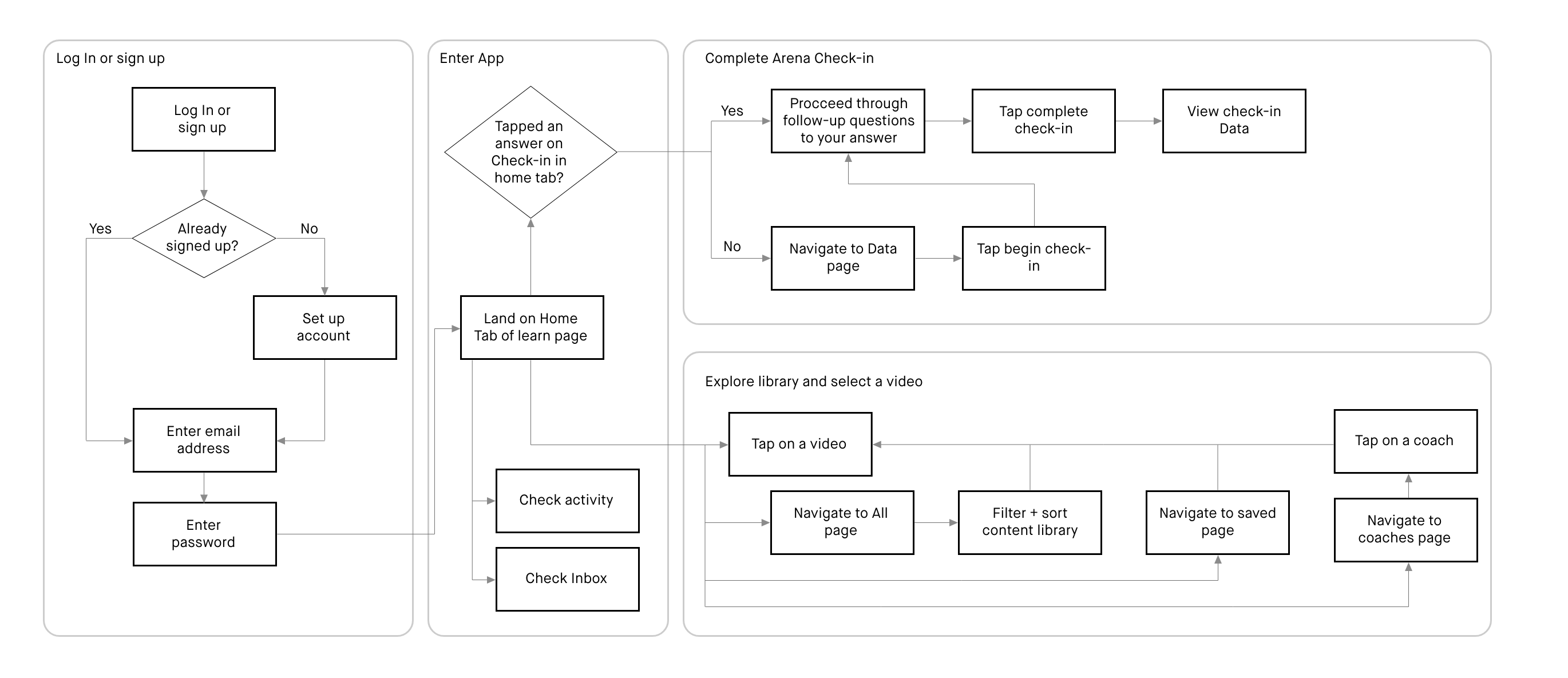
App Site Map


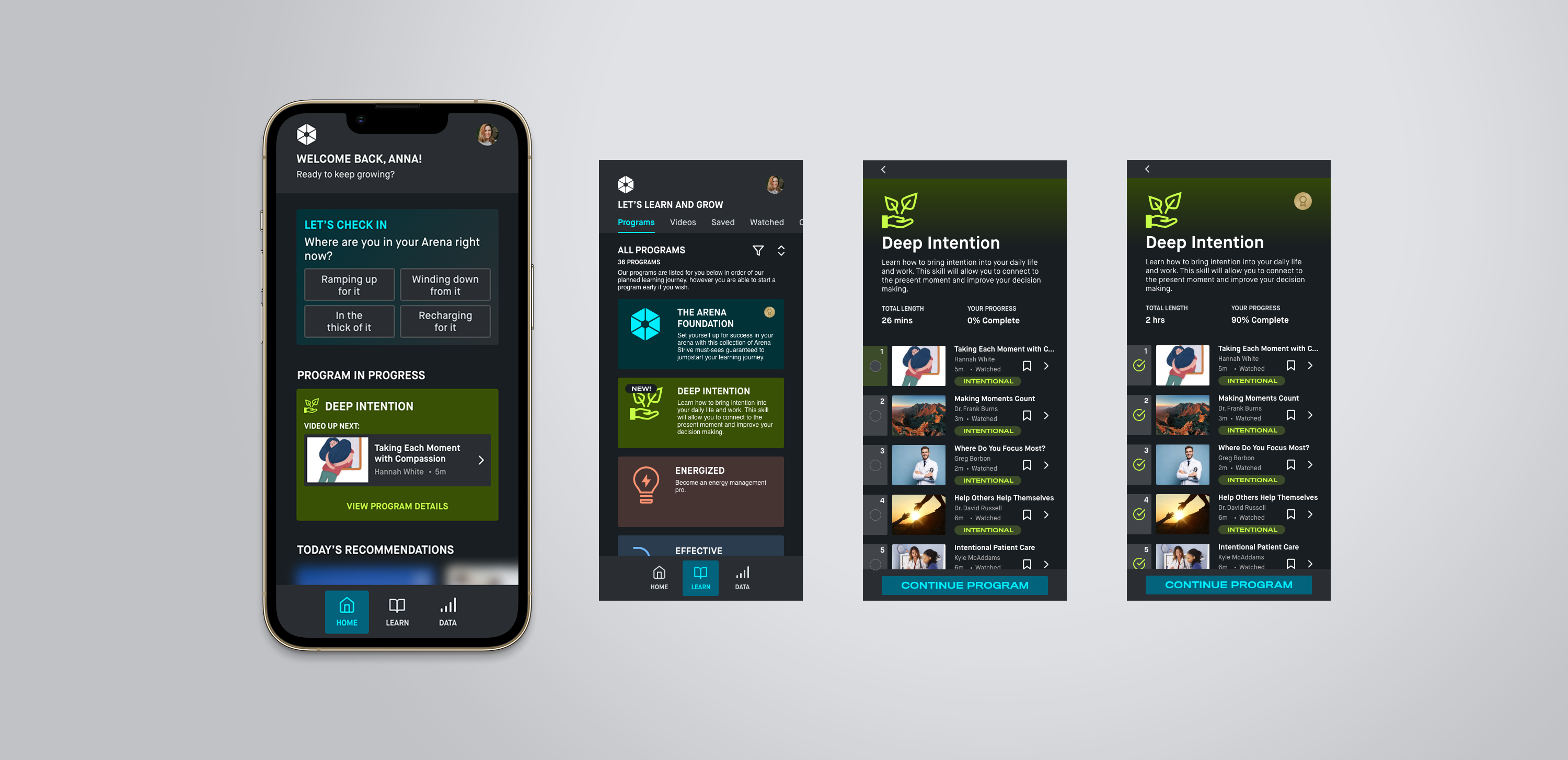
Arena Strive Refreshed
After going through the creation of lo-fi mockups and reviews, I applied the Arena Strive brand to the app and brought it into high fidelity.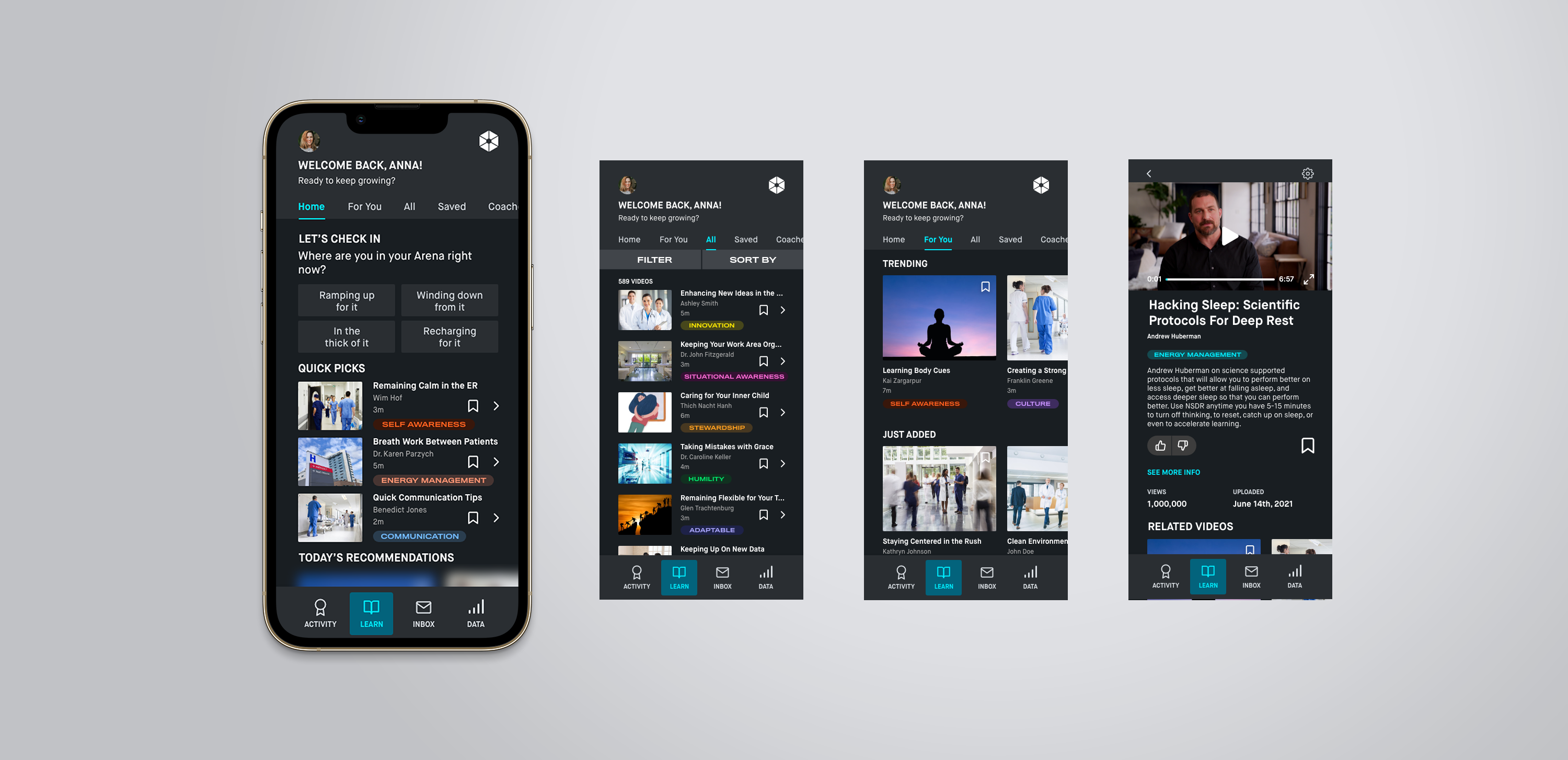

User Testing and Insights
The high fidelity mockups were then shown to users as a clickable prototype. As our users considered the app’s place in their daily routines, a key insight appeared:
“With my busy hours at the hospital, I often don’t have time or energy to sift through a library, even for 5 minutes. I just want someone to tell me directly what to watch on my break and what actions to take, so I have one less thing to think about.”
-Arena Partner Clinician
This insight evolved our understanding of how our application can and should best help front-line clinicians learn these key skills. Our priority shifted:
How can we create a learning platform for clinicians that guides their learning journey and quickly presents them with the actions they need to take to progress through that learning journey?

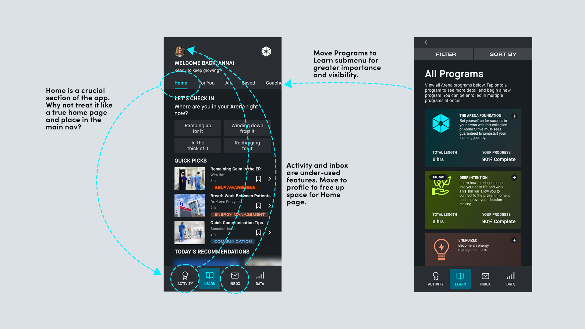
Reorganizing the App and Introducing Programs
In order to achieve this new priority I elevated programs, which were initially treated as an optional side-way for a user to engage with the content, to be the primary mode of engagement with the content for the user. Along with programs grew the need for a central home page to direct users to the key actions: progressing through programs and completing Arena Check-Ins. The current version of the app designated the “Learn” content library section as the home page, however this became obsolete with the lack of user desire to naviagte through individual videos in the library. To add space on the main navigation at the bottom, Inbox and Achievements were both moved to the profile as they were low-touch sections in testing and could be moved to a lower hierarchy.
Arena Strive:
Healthcare’s First Performance Coach

Future Goals and Takeaways
1. Total freedom isn’t always what the user wants. It’s easy as a UX/UI designer to assume that your user will get frustrated by parameters and hand-holding, but in the case of our busy clinicians it was something they actually preferred.
2. Modern and exciting design empowers users. The clinicians felt excited when they looked at my designs for the Strive app, remarking that after spending days looking at bland and outdated interfaces, it was refreshing to see a highly visual and modern app meant specifically for them and improving their day.
2. Modern and exciting design empowers users. The clinicians felt excited when they looked at my designs for the Strive app, remarking that after spending days looking at bland and outdated interfaces, it was refreshing to see a highly visual and modern app meant specifically for them and improving their day.